
Original Vintage Posters and Art work
ESTAMPE MODERNE ET SPORTIVE GALLERY
16 rue choron 75009 Paris
- A
- A.D
- A.Q. -
- AALTO Henrik ALVAR HUGO
- ABBE Albert
- ACCOLAY Poterie
- ADNET Jacques
- ADRIANI
- ADRION LUCIEN
- AFTER WAHROL
- AGOSTINI
- AHOLSER Peter
- AIGARD JEAN
- AIGNER Paul
- AILLAUD Gilles
- ALDELMO
- ALECHINSKY Pierre
- ALEXIS -
- ALICANDRI Vincenzo
- ALLARD GEORGES
- ALLEN Chas ( Charles)
- ALLUAUD Eugène
- ALLUT PINY -
- ALMALICTION
- ALO Charles-Jean
- ALONZO
- ALONZO PEREZ Mariano
- AMAN-JEAN E.
- AMBROISE D.
- ANDREINI O.
- ANDRIEU F.
- ANDRY FARCY Pierre
- ANGUS Max Rupert
- ANITA
- ANONYME ANONYM
- ANQUETIN Louis
- ANSIEAU ROLAND
- ANTON Entwurf Ottomar
- ANTRAL -
- AOHNAI -
- ARANGO
- ARDIN C,
- ARGENCE
- ARGUST
- ARMAN-ARMAND FERNANDEZ
- ARNAC MARCEL
- ARNDT Paul
- ARNO HELLA
- ARNOUX Guy
- ARNSTAM Cyril et Alexander
- AROU Georges
- ARROYO EDUARDO
- ARRUE Ramiro
- ARTIS
- ASIART -
- ASTIER
- ASTOR
- ATCHE Jane
- ATELIER BINDER
- ATELIER CLASSIC -
- ATELIER DIE DREI -
- ATELIER FINCK-GALLAND -
- ATELIER HOFMANN
- ATELIER PERCEVAL
- ATELIER PERCEVAL -
- ATELIER SCHMIDLIN ET MAGONI -
- ATELIER STRENGER REICHERT FOTO
- AUER F.
- AUGER Raoul
- AUGLAY Auguste
- AUGSBURGER Pierre
- AURIAC Jacques
- AUVIGNE Jean
- AUZOLLE Marcellin
- AUZOUX Louis Thomas Jérôme
- AYLWARD Wiliam James
- B
- BAC Ferdinand
- BACARISAS PODESTA Gustavo
- BADIA VILATO
- BAER Willy
- BAEZNER
- BAILIE Samuel Colville
- BAILLE Herve
- BAINBRIDGE John
- BAJTLIK Jan
- BALI Alberto
- BALI ALBERTO
- BALLESTER Anselmo
- BALLURIAU P.
- BALZAC Honoré de
- BANKOV Peter
- BARATA A.
- BARBA Raoul
- BARBE & ROBERSON Cie -
- BARBEDIENNE MAISON PARIS FERDINAND
- BARBERIS Franco
- BARBEY Maurice
- BARBIER George
- BARCET
- BARJANSKY
- BARRÈRE Adrien
- BARRIERE Georges
- BARTHOLOMO R.
- BASCH Arpad
- BASTARD Marc-Auguste
- BATE Firmin
- BAUBAUT LUCIEN
- BAUDELAIRE -
- BAUDICHON René
- BAUDOUIN P.
- BAUDRILLART Emmanuel
- BAUER
- BAUMBERGER Otto
- BAYHOURST André
- BAYLAC Lucien
- BAYLE Luc Marie
- BAZAINE Jean
- BAZIN François Victor François Victor
- BAZZONI A.
- BEAUDOUIN Eugene
- BEAUME EMILE
- BEAUPUY Louis Jean
- BEAUSSART _
- BECKNO S.
- BECQUEREL André Vincent
- BEERTS ALBERT
- BEGGARSTAFF prenom
- BEGGARSTAFF prenom
- BEGGARSTAFF prenom
- BEGHIA
- BEHEL HENRI
- BELIGOND
- Belinsky Constantin
- BELLANGER ALAIN
- BELLENGER JACQUES & PIERRE
- BELLERY-DESFONTAINES Henri
- BELLI ORSA STUDIO
- BELLIN Jacques-Nicolas
- BELLOGUET LEON
- BELNET Georges Albert
- BELON J.
- BELTRAME
- BENARD -
- BENDIX Hans
- BENITO E.
- BENOER Herant
- BERANN
- BERANN Heinrich Caesar
- BERCHMANS Emile
- BERGEVIN Albert J.P
- BERMOND André
- BERNARD FRANCIS
- BERNARD FRANCIS
- BERNAT TONI
- BERNI G.
- BERTAUX LUCIEN
- BERTHON Paul
- BERTIN
- BERTRAND. E.
- BERTUCHI MARIANO
- BESNARD Paul-Albert
- BEUZON Jean Louis
- BEZOMBES Roger
- BIAIS
- BIANCHI Alberto
- BILAL ENKI
- BILON J.
- BINDER
- BINDER Josef
- BINGLER MANFRED
- BINMORAN -
- BIRARD CHRISTIAN
- BIRKHAÜSER Peter
- BISCARETTI DI RUFFIA Carlo
- BJOR VIC
- BLACK Montague Birrel
- BLAEU Willem (Guilielmus)
- BLAIN
- BLAIRON -
- BLANDIN André
- BLANK
- BLANK André
- BLEIN Jacques
- BLEUER -
- BLIN Jacques
- BLIX CURT
- BLOCH Marcel
- BLOCTEUR Charles
- BLONDAT Max
- BLOT Léon Auguste
- BLUMER Lucien Charles
- BOCCASILE Gino
- BODINIET André
- BODONIANA -
- BOERKLY -
- BOFA Gus
- BOFILL
- BOHLE Mark
- BOILEAU-DESPRÉAUX Nicolas
- BOIRY Camille
- BOITEL Edmond
- BOLAND Walter
- BOMAR Walter
- BOMBLED Louis Charles
- BOMPARD J.M.
- BON Emille
- BONAMICI Luigi
- BONARD J.
- BONELLI J.
- BONFILS R.
- BONHEUR ROSA
- BONIS R.
- BONNARD Pierre
- BONNE Rigobert
- BONNEFOIT Alain
- BONNOT
- BONNOT M.
- BORA -
- BORELLI Stefano
- BORGONI - MBI MARIO
- BOSARTE -
- BOSCO -
- BOSSAERTS Walter
- BOTILL BELTRAN
- BOTTINI GEORGES ALFRED
- BOUCHAUD Etienne
- BOUCHAUD J.
- BOUCHER Lucien
- BOUCHER Pierre
- BOUCHET -
- BOUDON Emile
- BOUISSET FIRMIN
- BOULLIER ROBERT
- BOURAINE Marcel André
- BOURCARD
- BOURDIER
- BOURDIER ALAIN
- BOURGEOIS Yves
- BOUSSARD DENIS
- BOUTET DE MONVEL
- BOUTET DE MONVEL LOUI MAURICE
- BOUTET DE MONVEL B
- BOUTILLIER J.
- BOUTINOT Jacques
- BOUVARD René
- BOUVOT Paul
- BRACQ PAUL
- BRADLEY Will
- BRANCACCIO Carlo
- BRAQUE GEORGES
- BRAU Casimir
- BRAYER Yves
- BREGEON
- BREMPT Van PAUL
- BRENET Albert Victor Eugène
- BRENNUS Charles
- BRESSERVE (REB) RENE
- BRETT KOCH Ray
- BRIAND H.J.
- BRICHE -
- BRIDGE JOE
- BRIGGS Austin
- BRINDEAU
- BRINDEAU DE JARNY Louis Edouard
- BRIQUEMONT Jean Auguste
- BRISSAUD Pierre
- BRODERS ROGER
- BRODOVITCH ALBERT
- BROEK TEN Willem Frederik
- BRONDY Mattéo
- BROQUET Gaston
- BROWNE Tom
- BRUDO Yvonne
- BRUN A.
- BRUN Donald
- BRUNEAU
- BRUNETTA
- BRUNO PAUL
- BSOR Charles
- BUB Karl
- BUCKMANN P.
- BUFFET Bernard
- BUGATTI Ettore
- BÜHLER Fritz
- BUHOT J.
- BÜHRY E.
- BUIOZ _
- BURGER Willy Friedrich
- BÜSCHELBERGER Anton
- BUTTERI Achille
- BUYER YVES
- BUZZI DANIELE
- BYDO -
- C
- C.B prenom
- C/PUB -
- CACHOUD François Charles
- CAHON A.
- CAIN Georges
- CALDER Sandy
- CALPARSORO José
- CAMBON Glauco
- CAMPION
- CAMPS Gaspar
- CANALE V.
- CANCELLIERI Philippe
- CANCIANI ALFONSO
- CANEARET J.
- CANIZARES -
- CAPELLA
- CAPELLI Osvaldo
- CAPLEN -
- CAPON Georges Emile
- CAPPIELLO Leonetto
- CAPRONI Giovanni Battista
- CARAN D'ACHE (Emmanuel Poiré
- CARBONI ERBERTO
- CARDINAL E.
- CARDINAUX ALFRED
- CARDINAUX EMIL
- CAREL R.
- CARIGIET Alois
- CARLIER Émile Joseph
- CARLU Jean
- CARON Alexandre Auguste
- CARQUEVILLE William
- CARRÉ LÉON
- CARRIAT-ROLANT Gabriel
- CARRIÈRE Eugène
- CARTIER Jacques
- CASAS Y CARBO RAMON
- CASPARY -
- CASSANDRE Adolphe Mouron
- CASSANI Giovanni
- CASSARD
- CASSIERS Henri ou Hendrick
- CASTAGNE
- CASTY Gian
- CATTIALDO -
- CAUVY Léon
- CAVAILLES Jules
- CAVALERI Ludovico
- CAVÉ Lucien
- CAVIGIOLI Riccardo
- CAZALS
- CELLO -
- CELOS Julien
- CENNI
- CENNI
- CEVENINI A.
- CEZANNE PAUL
- CHABOSEAU JEAN
- CHAGALL
- CHAMBRELENT
- CHAMPSEIX PAUL
- CHAMSON André
- CHANO -
- CHAPELET ROGER
- CHAPELLIER P.
- CHAPLIN SPENCER Charles
- CHARBONNIER
- CHARIERAS Y.
- CHARLAS
- CHARLE-LUCAS E.
- CHARLES
- CHARLET F.
- CHARPENTIER Alexandre
- CHASSAING J
- CHAUFFARD H.
- CHAUVEAU Marcel
- CHAVANNE Georges. C.
- CHAVEPEYER Albert
- CHEM .
- CHERET Jules
- CHIARELLO -
- CHIMOT Edouard
- CHING E.
- CHOUBRAC Alfred
- CHRISSON -
- CHRISTIANSEN Hans
- CIESLEWICZ Roman
- CIUTI Enrico
- CLADO L.
- CLAILLANT
- CLARETIE Jules
- CLARK C
- CLAUDIN Pierre Roger
- CLAVÉ Antoni
- CLERISSI
- CLOUET Emile
- COCTEAU Jean
- CODOGNATO Plinio
- COFFIN -
- COINON M.
- COLAERT J.D
- COLB H.
- COLE Fred
- COLETTE
- COLIN Jean
- COLIN Paul
- COLLECTIF
- COLLECTIF
- COLLET -
- COLLIN EDOUARD
- COLOMBI Plinio
- COMBA Pierre
- COMMARMOND PIERRE
- CONTEF JEAN CH.
- COOK
- COOK MATTHEW
- COOPER -
- CORNIC Alain
- CORNIL GASTON
- COSSARD Adolphe
- COSTA Mirau
- COTTO -
- COUILLARD Roger
- COULANGE
- COULET L.
- COULIN E.
- COULON
- COURCHINOUX EDOUARD
- COURONNE -
- COURONNEAU E.
- COURTELINE Georges
- COURTOIS Raphaêl
- COURVOISIER
- COUSYN E.L
- COVENTRY Fred
- COX R.
- COZZO S.
- CRAFFONARA MARIO AURELIO
- CRAIG Barry
- CRAS Monique
- CREATION P.B.
- CRESPIN A. L. C.
- CRESPO -
- CRISS Francis
- CROMIERES HUGUETTE
- CROS M.
- CROSBY Frederick Gordon
- CUENCA MUNOZ RAPHAEL
- CUNEO Terence Tenison
- CURR Thomas
- CUSSETTI CARLO
- D
- D'ALESI HUGO
- D'HUUGHE -
- D'YLEN Jean
- D'YLEN.. Jean
- D.N dit DECAMP
- D.P
- DABO Léon
- DAGNAUX Albert Marie
- DAGNES -
- DAGOUSSIA
- DALI Salvador
- DALPAYRAT Pierre Adrien
- DAM dit DAMOUR
- DAMIANI -
- DAMMY R.
- DAMSLETH Harald
- DANILO Robert
- DAPENA PARILLA Juan
- DARD Maurice
- DAUDET Alphonse
- DAVID
- DAVIEL DE LA NEZIERE JEAN
- DAVIS Paul
- DE BAS Pierre
- DE BERGEVIN E.
- DE BUSSCHERE Constant
- DE CASABIANCA-HUMBAIRE LOUIS
- DE CHIRICO Giorgio
- DE FEURE Georges
- DE FLEURAC LOUIS
- DE GOEYE M.
- De GUINHALD Bernard
- DE GUNIHALD Bernard
- De KAROLIS Adolfo
- DE LA NEZIERE JOSEPH
- DE LOSQUE
- DE LUCA F.
- de MAROLLES Michel
- DE MAY W.R.
- DE RENAUCOURT Henri
- DE RIQUER A.
- DE RONCOURT Jean
- DE SOETE Pierre
- DE VALERIO ROGER
- DEBUT MARCEL
- DECAISNE JOSEPH
- DECOEUR Emile
- DEFER Jules
- DEFONTAINE G.
- DEHEDIN ALPH
- DELARUE - NOUVELLIERE Pierre Charles
- DELAVAT Charles
- DELAYE T.J.
- DELFO Yves
- DELGADO THEODORO
- DELIUS C.
- DELLEPIANE David
- DELODDERE
- DELORME M.
- DELORMOZ Paul
- DELOURMEL ANDRÉ
- DELPECH Jean-Marie
- DELPY Jacques Henri
- DELRY FRANCOIS
- DELVAL
- DELVILLE F.
- DEMAND Carlo
- DENFIELD EDWARD
- DENIS Maurice
- DENIS CLAUDIUS
- DEPAYES -
- DERAIN André
- DERAT
- DERCHE Charles Edouard
- DERGEG
- DEROUET-LESACQ -
- DES GACHONS Jean
- DESALEUX Jean
- DESCOMPS Joe-Joseph
- DESCOMPS Jean Bernard
- DESETA Enrico
- DESGRANDCHAMPS MARC
- DESHAYES Eugène François
- DESMÉ Henri
- DESMEURES Victor Jean
- DESNOYER François
- DESPALLES
- DESPILIS A.
- DESPORTES
- DESSOULLES M
- DETAILLE G.
- DEVENET
- DEVILLE Maurice
- DEZITTER J.
- DI LAZZARO Umberto
- DI LAZZARO Umberto
- DI LULLO
- DI ROSA HERVÉ
- DIAZ Bueno
- DIAZ-JARA J .y. R
- DIGGELMANN Alex Walter
- DIGNIMONT André
- DINET Etienne
- DIOSI Ernest Charles
- DIRKSEN AEYN
- DIXM CHARLES
- DIXON Leng
- DOBOUJINSKI Mstislav Valerianovitch
- DOEVE Eppo
- DOGNIBENE -
- DOILLON-TOULOUSE Madeleine
- DOL
- DOLA GEORGES
- DOMBROWSKI
- DOMERGUE JEAN GABRIEL
- DON Doe
- DON Jean
- DONINI-MONTI Corrado et Fernando
- DONNAY Auguste
- DORÉ Jean
- DORFI
- DORIGNAC
- DORIVAL GEORGES GEO
- DORMOY H.
- DORO Theo
- DOUDELET C.
- DOUDOW TRAPOTAT
- DOUGLAS Franck
- DOW Arthur, Wesley
- DRANSY JULES ISNARD
- DRIAN ETIENNE
- DROIT Jean
- DROPSY HENRY
- DROUIN -
- DROUOT Edouard
- DRYDEN Ernst Deutsch
- DUBAUT Pierre-Olivier
- DUBOIS Jean
- DUBOIS PAUL ELIE P.E.D
- DUBOUT
- DUCATEZ Raymond
- DUDOVICH Marcello
- DUFAU Clementine Hélène
- DUFLO Leopold
- DUFY Raoul
- DUHAMEL GEORGES
- DUMAS
- DUMOULIN -
- DUNACH
- DUPAS Jean
- DUPIN Leon
- DUPONT Emile
- DUPUIS Daniel
- DURIEUX Roger
- DUVAL CONSTANT
- DUYCK E.D
- DZUBAS Willy
- E
- E.C
- EBNER Emil
- EDEL Edmund
- EDIA CREATION
- EFF D'HEY -
- EGGLESTON EDWARD M.
- EICHHORN G.
- EIDENBENZ Hermann
- EIFFEL Gustave Alexandre
- Eisch Erwin
- ELD STEN
- ELIOTT HARRY
- ELZINGRE Edouard
- EMOOXOC -
- ENDLER Milos
- ENGELMAN Hans
- ENGUEHARD Sylvain
- ENRIETTI J.
- ERGÜVEN Nurettin
- ERIC
- ERMA -
- ERNST Otto
- ERTON
- ESMAN Jean-Pierre ART-VITRINES
- ETAIX Pierre
- ETTAIT -
- EVE -
- EVEN
- EVENEPOEL Henri
- EWART Peter Maxwell
- EXCOFFON ROGER
- EXPOSITION EN COURS
- EYMONNET
- EYNE VD
- F
- FABIANO
- FABIGAN Hans
- FABIO -
- FABRY Emile
- FAF ZENNER -
- FAGES Arthur Raoul
- FAIRAUS F.
- FAIVRE ABEL-JULES
- FALCK Jarl
- FALCUCCI ROBERT
- FARIA-ARAGONEZ DE Jacques
- FAURE.L LUCIEN
- FAURET Léon Jean Joseph
- FAVRE Georges
- FAVRE GEORGES ALFRED
- FAY Georges
- FD
- FEHRER
- FELIX LEON
- FELL Maurice
- FENEYROL J.
- FENNEKER Josef
- FER Edouard
- FERNEL F.CERCKEL
- FERNEZ Louis
- FERNIER ROBERT
- FERRACCI René
- FERRAGUTI Arnaldo Mario
- FERRARI Giulio
- FERRIE
- FESEKE Dieter
- FEVRE Gisèle
- FIDI -
- FIEVET Maurice
- FILLOL L.
- FiNEL C.
- FINOT Emile
- FIORE AMLETO
- FISA
- FISCHER Otto
- FISCHER P.
- FISCHL
- FLAC
- FLAGG James Montgomery
- FLANDRIN Jules
- FLINK
- FLOR
- FOACHE Arthur
- FOCHT Frédéric
- FOLART Henri
- FOLON Jean Michel
- FONILLIA R.
- FONTAN LEO
- FONTANA Lucio
- FONTANET Noël
- FOORD Jane
- FORAIN J.L.
- FORE -
- FORESTIER Etienne
- FORNASETTI Piero
- FORTIN Jean
- FORTUNATO DEPERO
- FORTUNEY
- FOUJITA Tsugouharu
- FOURNERY
- FOURQUERAY Charles
- FRAIKIN
- FRAIPONT Gustave
- FRAISSE E.
- FRAISSEDEME
- FRANCIOLI
- FRANZONI Roberto
- FRECOURT
- FREMOND
- FREY Eugène
- FRIES -
- FRITZ RHEM
- FROCK
- FROIDEVAL J.L
- FROMENTIER Paul
- FRUGIER-FEM -
- FURTER
- G
- GABARD Ernest
- GABRIEL PIERRE
- GADOUD L
- GAILLARD Emmanuel
- GAILLARD HUBERT
- GAISFORD
- GALEMA Arjen
- GALET Gaston-Pierre
- GALICE Louis
- GALLAND ANDRE
- GALLAND Gilbert
- GALLI Stan
- GALLICE A.
- GAMES Abraham
- GAMY MARGUERITE
- GANEAU F.
- GANTCHEFF Ghanu
- GARCIA Jean
- GARCIA Julio
- GARET
- GARIN LOUIS
- GARMY René
- GARREAU GEORGE
- GARRETTO Paolo Federico
- GARRIC Fernand
- GARU Leon
- GASHE Albert
- GAUDY Georges
- GAULT Jo
- GAULTHIER
- GAUSSON Leo
- GAUTHIER Alain
- GAUTIER -
- GAWTHORN Henry George
- GAZAY Robert
- GELAS
- GENEUX A. JOHN
- GENICOT R.
- GEO
- GEO WEISS
- GEO BRIC Georges
- GEO HAM Georges
- GEOLINA -
- GEORGET Guy
- GERA Mario
- GERACI Nino
- GERALE N.
- GERBAULT Henry
- GERMA Henri
- GEROLD Hunziker
- Geruy
- GERVESE HENRY
- GESMAR Carl Charles
- GIACOMETTI Alberto
- GIACOMETTI Augusto
- GID Raymond
- GIDE André
- GIEGEL Philippe
- GIFFORD
- GILBERT Alfred
- GILETTA Francis
- GILIS Ed.
- GILL André
- GILLET A.
- GINELLO Averado
- GIRARD Dit ''GIR'' André
- GIRARDOT G.
- GIRAUDOUX Jean
- GIRBAL
- GIROUX André
- GIRRE Pierre
- GISCARD Henri
- GLASER Milton
- GLENNY A. R.
- GLÜZING Martin Franz
- GOLAY MARY
- GOLVEN A.
- GOOSSENS G.
- GORDE
- GORGUET Auguste
- GOSE J.
- GOTSCHKE Walter
- GOTTLOB Fernand Louis
- GOURDET MARCEL
- GRANNIS Leroy
- GRANVAL René
- GRASSET Eugene
- GRASSI Vittorio
- GRAVIER -
- GRAY HENRI
- GRAZ John
- GREIF
- GREIFFENHAGEN M.
- GREINER
- GREUZE prenom
- GRIGNON Ph.
- GRIM -
- GRINSSON Boris
- GRISANI -
- GROESTS
- GROOT Jac
- GROSLIER Georges
- GROSS NIKLAUS
- GROSSMAN T.Renouf
- GROZDANOVITCH ANDRÉ
- GRUAU René Renato Zavagli
- GRUN J.
- GRUNDMANN Guenther
- GUEDAN MARTIN
- GUEGAN Philippe
- GUERRA
- GUERRY Louis
- GUEUDEVILLE Nicolas
- GUIET André
- GUIHARD
- GUILLAUME Albert
- GUILLEMAIN
- GUILMET André Romain
- GUIMARD Hector
- GUINGOT Louis
- GUIRAUD RIVIERE Maurice
- GURTNER
- GUSTO
- GUTHSCHMIDT ANTHONIUS MATHIEU
- GUY DU PASSAGE
- GUYDO - Guillaume LE BARROIS D'ORGEVAL Henri
- Guyon Maximilienne Marie Annette
- GUYOT GEORGES LUCIEN
- GUZZI CARLO
- GYGAX -
- GYGER Emanuel
- H
- HAFFNER Léon
- HAMILTON A.E.
- HAMNER
- HANDSCHIN Johannes
- HANES ( HANESSE ) ROBERT
- HANNOTIAU Alexandre
- HANSEL Karl
- HANSI
- HARALD
- HARDY Dudley
- HARFORD
- HARRIS E.
- HARRY
- HÄRTL Eugen W. Max
- HARTUNG HANS
- HASHIM
- HASSALL John
- HASSALY
- HAUDEPIN F.
- HAUSS Friedemann
- HAUVILLE Etienne
- HAVIES Jean
- HAZENPLUG F.
- HAZERION
- HECHTEPOBA M
- HED MEYER -
- HEE Jean
- HEINTREIN
- HEM ROGER
- HEMJIC Marcel Jacques
- HENAUT J.
- HENCHOZ S.
- HENEL Edwin H.R.
- HENRY Hervé
- HENZIROSS Eugen
- HERDEG Walter
- HERGÉ Dit Georges Remi
- HERMANS E.A
- HERMES Erich
- HERVIAULT ANDRE
- HERZIG Edouard
- HETREAU Remy
- HEUGA M.
- HICKMANN Fons
- HIERL Alfred
- HINGANT R.
- HINGRE
- HINGRER
- HIRO PIPER -
- HOCKNEY DAVID
- HOFER Josef
- HOFMANN Wlastimil
- HOHENLEITER Francisco y Castro
- HOHENSTEIN Adolph
- HOHLWEIN Ludwig
- HOLLY -
- HOLM Thomas
- HOMANN Johann Baptist
- HOMANN Johann Baptist
- HORAK Ladislav
- HORÁK Ladislav
- HORNUNG JEAN
- HOUBÉ -
- HOWARD Andrew
- HUEBNER Mentor
- HUET Marcel
- HUG -
- HUGO Victor
- HUGON R.
- HULOT Suzanne
- HUMAIR DANIEL
- HUNCER Hans
- HUNZIKER Max
- HUREL Clement
- HURTADO Luis Carlos
- HUSSON Léon
- HUVEY Louis
- HYLAND Ellis
- HYNAIS V.
- I
- J
- J.D.
- JA Yves
- JACK prenom
- JACOBSON Erica
- JACQUELIN _
- JACQUEMIN André
- JACQUET
- JAHN Gustav
- JAL -
- JAMMES Francis
- JAN MARA Jean
- JANK A
- JANPELTIER
- JARACH ET CHAMBON Ch. et P.
- JARRY Robert
- JARUSKA Wilhem
- JAZET JAPHET ALEXANDRE J
- JEAN-LUC JEAN DIT LUCHESI
- JIRALDO -
- JOACHIM
- JOB Jacques Marie
- JOBERT Paul
- JOHNS Jasper
- JONAS
- JORDANA Joan Anton
- JOROUX
- JOSSO Camille Paul
- JOSSOT Henri
- JOSSOT Henri Gustave
- JOUINEAU et BOURDUGE Guy
- JOURDAIN H.
- JOUVE Georges
- JOY Williams
- Julien Jean
- JUNGBLUTH
- JUNOT J.P.
- Jwight shepler
- K
- KAEPPELIN Philippe
- KAMBOURIAN RON
- KAMMULER
- KARMAN Sandy
- Kath Gitte
- KATZOURAKIS Michalis
- KAUFFER Edward Mc Knight
- KECK Leo
- KEENE Norman
- KELLY Harry
- KELSEY Sterett-Gittings
- KEMP PERCY
- KERSTERS F.
- KESTERS F.
- KIFFER CHARLES
- KIL CHARLES
- KING A.W
- KING Marcus
- KIPLING Rudyard
- KLAPHECK KONRAD
- KLAUSFELDER -
- KLEIN David Fedric
- KLOKIEN
- KLOTZ & KIENAST Anton & Eugen
- KLUNDER Barbara
- KOCH Walter
- KOEN VAN OS -
- KOLLER RUDOLF
- KONLEIN J.Roberts
- KOO Nicolaas
- KORSCHANN Karl
- KOSEL
- KOUPER Léo
- KOWALESKI
- KRALI
- KRAUSZ
- KRAYER Gino
- KÜHLHORN Lotta
- KÜHN Charles
- KUNST CARL
- KURIYAWAGI
- L
- L BONA CINI
- L.W
- LABAN
- LABATTI
- LABERTHE Victor
- LABISSE Felix
- LABRET J.C
- LACAZE JULIEN
- LACHAUX JEAN
- LACHEVRE
- LACROIX Pierre
- LADUREAU
- LAFON Paul Henry
- LAFONT Emile René
- LAGACHE -
- LAHALLE Pierre
- LALIQUE RENE
- LALLEMANT Robert
- LAMPITT Ronald
- LAMPLOUGH Augustus Osborne
- LANCASTER
- LANCY Bernard Blanc-Percy
- LANDI -
- LANDRIEUX G.
- LANNERBACK
- LARRAMET Hilaire Z.
- LARSEN Hugo Valdemar
- LASKOFF Franz
- LATASTE R.
- LAUBI Hugo
- LAURENCIN _
- LAURENT Ernest
- LAURO
- LAVEE Adolphe
- LAVERS Ralph
- LAVIES Jan
- LAWLER Paul Georges
- LE FAGUAYS dit "FAYRAL" Pierre Camille Marie
- LE MONNIER Henry
- LEANDRE Charles
- LEBÈGUE Léon
- LECOMTE André
- LEDUC M.
- LEFEVRE L.
- LEFOR
- LEGENDRE Yann
- LEGER FERNAND
- LEGER Jean
- LÉLÉE LÉO
- LELONG RENE
- LEMMEL CHARLES
- LEMMENS CHARLES
- LEMO
- LEMOINE-MAUDET (alias LEM) Louis
- LEMONNIER HENRI
- LENDEN London
- LENGELLÉ Paul
- LENHART
- LENHART Franz
- LENOIR Jacques
- LEONEM
- LEONNEC Georges
- LEPAPE Georges
- LEPUY
- LEQUESNE Fernand
- LEROUX Auguste
- LEROY M.
- LESSIEUX Louis Ernest
- LETOURNEUR RENE
- LEUENBERGER Charles
- LEUPIN HERBERT
- LEVASSEUR Victor
- LEVERD P.
- LEVY Emile
- LEYENDECKER Joseph
- LEYERT
- LEYGNAC G.
- LG
- LIBIS-LIBISZEWSKI Herbert Berthold
- LICHTENSTEIN ROY FOX
- LIMELLO A
- LINDENSTACSK
- LINGSTROM
- LISKA Hans
- LISSAC PIERRE
- LLONS GUERAS JAUMES
- LOBEL RICHE ALMERY
- LOCHARD Felix
- LÖDER -
- LOIR Luigi
- LOJACONO -
- LOOSER HANS
- LOPEZ
- LOPEZ EMMANUEL
- LORANT
- LORANT-HEILBRONN Vincent
- LORENZI Alberto Fabio
- LOREZ F.
- LOTTI
- LOUPOT Charles
- LOURDIN R.
- LOUREIRO E.
- LOUYS Pierre
- LOVATELLI
- LOZANO DE SOTES Pedro
- LUC JEAN
- LUC Jean
- LUCAS Charles
- LUCE MAXIMILIEN
- LUDEKIN Fred
- LUNEL Ferdinand
- LUNOIS Alexandre
- LUPA
- LUPPI A.
- LURY -
- LW
- M
- MABILLE PIERRE
- MAC -
- MAC DONALD
- MAC ORLAN Pierre
- MACHATCHEK PH
- MACHATSCHEK
- MAESTRI
- MAGRINI Adolfo
- MAGRITTE René
- MAHRER W.
- MAIRE André
- MAITRE Jean
- MAITREJEAN Jean
- MAJORELLE Jacques
- MALCLES Jean Denis
- MALESPINA L.
- MALFROY-SAVIGNY HENRY
- MALINARD J.
- MALLET Béatrice
- MALLET STEVENS ROBERT
- MALTESTE-DIDOT Louis-Gelis
- MAN RAY ( Radnitzky ) Emmanuel
- MANCIOLI Corrado
- MANE A.
- MANGOLD
- MANLIO Parrini
- MANSET REGIS
- MANUEL Frères
- MARANGOLO
- MARAST
- MARC
- MARC -
- MARCHAL-SIMON- CMS Colette
- MARCHAND Camille Maurice
- MARCO -
- MARCUS -
- MARDINI G.E.
- MARFURT Leo
- MARIE Gustave
- MARIE MARIN
- MARINETTI A.
- MARODON Maurice
- MAROY
- MARPO -
- MARQUET ALBERT
- MARREC
- MARSH LUCILE PATTERSON
- MARTEL Jan & Joel (FRERES)
- MARTIN BOB
- MARTIN C.
- MARTIN A.
- MARTIN Fernand
- MARTINATI Luigi
- MARTINET Milo
- MARTON LAJOS
- MARTY A.E.
- MARVAL
- MARX M.
- MASCII Jean
- MASON Frank Henry
- MASS'BEUF -
- MASSE
- MASSEAU Fix
- MASSEAU Pierre
- MASSIN Charles
- MASSIOT Georges
- MASSON
- MASUI LASTRIQUE Paul Auguste
- MATALONI G.
- MATEJKO Théo
- MATET Jean
- MATHIEU Georges
- MATISSE Henri
- MATTER HERBERT
- MATTHEY
- MATTHIEU-LOPEZ Benoit-Emmanuel
- MATTON Arsène
- MAURIN
- MAUROIS André
- MAURUS EDMOND
- MAUZAN Achille
- MAX (Finkelstein) Peter
- MAXIM Geo
- MAXY LEO
- MAYET-SCHÜTZ Robert
- MAYO Eileen
- MAZZA Aldo
- MAZZEI Giuseppe
- MEDAILLE -
- MELIO E.
- MENARD Emile-René
- MERCIER Etienne
- MERCIER JEAN ADRIEN
- MERLET Erwin
- MERLIN Pierre
- MERSON L.O.
- MERWART Paul
- METIVET Lucien
- METLICOVITZ Leopoldo
- MEUNIER G.
- MEUNIER H.
- MEURISSE -
- MEURS TOM
- MEYER HED
- MICH
- MICHAEL -
- MICHAUD René
- MIDDERIGH J.J.
- MIGLIORATI Viero
- MIGNOT Victor
- MIKLOS Gustave
- MILLIERE MAURICE
- MILLIERE Maurice
- MINARDI A.
- MINGOZZI Giovanni
- MINK M.
- MINNE B.
- MINONZIO Giuseppe
- MIOLLAN Robert
- MIRACOVICI Paul
- MIRADE GIRALT
- MIRO Joan
- MIST H-M
- MISTI
- MODIANO -
- MODIGLIANI Amedeo Clemente
- MOHR PAUL
- MOLINS CHARLES HENRI
- MOLNE VIDAL Luis
- MOLUSSON A.
- MONET -
- MONEY Fred
- MONTAUT Ernest
- MONTESQUIEU
- MOORE A.Walter
- MOORE G.
- MOOS Karl Franz
- MOPENO
- MOR -
- MORACH
- MORANTE
- MOREAU VAUTHIER PAUL
- MOREAU-NELATON Etienne
- MOREL de TANGUY
- MORELL JOSEP
- MORERA B.
- MORETTI Raymond
- MORIN Louis
- MORIS -
- MORRIS Check
- MORROW A.G.
- MORVAN Hervé
- MORY
- MORY -
- MOS -
- MOS - ALMOS - Mario De Berardinis -
- MOSNER Ricardo
- MOUCLIER Marc
- MOUREN HENRI LAURENT
- MOURGUE Pierre
- MOZ
- MSIKA prenom
- MUCHA Alphonse
- MUCHA Willy Willy
- MUGGIANI Giorgio
- MÜLBERGER Max
- MÜLLER Johann Emil
- MULLER-DACHAU HAND
- MÜLLI Rudolf
- MUNDORFF Victor
- MUNIZ VIK
- MUSATI Arnaldo
- N
- NABRIN JM
- NACHIPEIN A-
- NAIR
- NANI
- NASH DAVID
- NATHAN GARAMOND Jacques
- NAURAC Jean Raoul
- NEBO ET WILSE -
- NERVAL Gérard de
- NEU -
- NEUMON
- NEVIL André
- NEVIN Arthur
- NEWBOULD FRANCK
- Ng D CHI -
- NICO B.
- NICO EDEL
- NICOLITCH GEORGES
- NIELSEN Otto
- NILSGUSPER -
- NISTRI ENZO
- NIVA prenom
- NIVAULT André
- NIX -
- NIZZOLI Marcello
- NOCKOLDS Roy
- NODIER Charles
- NOÊL Guy-Gérard
- NOGARO
- NOMELLINI Plinio
- NONNI Francesco Umberrio
- NORDMAN -
- NOROY
- NORTHFIELD James
- NORTIER Constant
- NORTON J.
- NOURY Gaston
- NOX -
- NOYER Ph.H.
- NYS Francis
- O
- P
- P.O
- PAGÈS Raymond
- PAGNOL Marcel
- PAIGNANT M.
- PAILLET Charles
- PAL
- PALLANDRE M.
- PALLIER Raymond
- PAMPAGLINI -
- PANCKOUKE CHARLES - JOSEPH
- PANSING FRED
- PAOLO Henri
- PAQUIER J.
- PARILLA
- PARRILLA Abelardo
- PARRISH MAXFIELD
- PASCHE John
- PATON D.
- PATRIARCHE L.
- PATRONE
- PAYEN Henri
- PEAN René
- PECNARD E.
- PECOUT A.
- PÉGUY Charles
- PEIKERT Martin
- PEINADO Joaquin
- PELLERIER Maurice
- PELLICO Silvio
- PENFIELD Edward
- PENFIELD Edward
- PERAKIS THEOCHARIS H.
- PERI Lucien
- PERIBERT
- PERNET
- PERON RENÉ
- PEROT
- PERREN BARBERINI -
- PERREN-BARBERINI -
- PERREY LOUIS JUSTIN MAURICE
- PERRIN
- PERRONET M.
- PERTEOUS R.H.
- PERZEL PERZEL
- PESKE
- PETITJEAN EDMOND MARIE
- PEYNOT Emile Edmond Jean
- PEYRE
- PEZILLA Mario
- PHILIBERT Albert Gilbert
- PHILIPPE Charles-Louis
- PIA
- PIARD
- PIATTI Celestino
- PIAUBERT Jean
- PICART LE DOUX JEAN
- PICASSO Pablo
- PICHAT Olivier
- PICHIO Roger
- PICHON
- PIGALLE Jean-Baptiste
- PIJOAN
- PILLOD J.
- PILLOT Lucien M.
- PIM -
- PINCHON Joseph Porphyre
- PIOLLENC Ray M.
- PIQUEFEUX -
- PIQUILLO
- PIRANESI Giovanni Battista
- PISSIS Roger
- PIVA Michèle
- PLANSON André
- PLAQUET
- PLENERT Prof.
- PLESCHACHER Kurt
- PLESSEN Hans WilH
- PLETSCHER -
- PLONZEAU
- PLOZ -
- PODIEBRAD
- PODIEBRAD prenom
- POILPOT Théophile
- POISSONNIÉ Jean -René
- POITEVIN
- POITEVIN G.
- POL RAB
- POLARD HENRI
- POMBO A.
- POMI Alessandro
- POMPON François
- POMPOUGNAC
- POMPOUGNAC -
- PONCHIN Jos Henri
- PONTABRY
- PONTOY Henri Jean
- PONTY Max
- POULBOT Francisque
- POUSTHOMIS
- PRANCE Bertram
- PREJELAN
- PRICE Julius
- PRIVAT Gonzague
- PRIVAT LIVEMONT
- PRODUCT
- PROUST
- PRUDHOMME P.
- PRUNIERE J.
- PRUNIERE JEAN
- PUPPO Mario
- PURVIS Fred W.
- PURVIS Tom
- PUVIS DE CHAVANNES
- Q
- R
- R-B
- R.P
- RABIER Benjamin
- RADICE -
- RAGAN LESLIE
- RAMBERT
- RAMEL Jacques
- RAMON C.
- RANDALL Maurice
- RAPENO Armand
- RAPHANEL
- RAPI Fabio Luigi
- RASSENFOSSE A.
- RAVEL Edouard John E.
- RAVO René
- RAZZIA Gérard Courbouleix
- REALIER-DUMAS Maurice
- REB Henry
- RECKZIEGEL Anton
- REDON Georges
- REED E.
- REGAERT A.
- REHM Fritz
- REHM Maria
- REISNER
- RENARD JULES
- RENAU BERENGUER Josep
- RENAULT Albert Fernand
- RENÉ GABRIEL
- RENEVEY A.
- RENEVEY GEORGES
- RENLUC
- RETROSI Virgilio
- REUS Juan
- REUSS ARMAND
- REUSSNER CHARLES
- REY Alphonse
- RHEAD Louis
- RIBERT -
- RIBET René
- RICCIARDI -
- RICCOBALDI
- RICHARDSON J.
- RICHMOND Leonard
- RIGAUD PIERRE GASTON
- RINGEL M.
- RIOM GUSTAVE
- RIQUEFEU A
- RITTMARK -
- RIVERE R.
- RIVIERE H.
- RIXENS E
- ROB HENRY
- ROB ROY
- ROBBE Manuel
- ROBERT ANDRÉ
- ROBERT Louis
- ROBERT VINCENT
- ROBERTO -
- ROBERTSON Graham
- ROBIDA Albert
- ROBIQUET LUCAS Marie Aimée
- ROBJ
- ROBYS ROBERT WOLF
- ROCH E.
- ROCHEGROSSE GEORGES ANTOINE
- ROCQUES FRANÇOIS
- RODMELL Harry Hudson
- ROEDEL
- ROGANEAU François Maurice
- ROGER GUILLAUME
- ROGER Léon
- ROGGERO -
- ROJAC Roger
- ROL AGENCE -
- ROLLAND Romain
- ROMAINS Jules
- ROMARE Bearden
- ROMBERG F.
- ROMES A
- ROMOLI
- RONVAL prenom
- ROOWY Yves
- ROQUE P.
- ROQUIN A.
- ROQUIN A.
- ROSENTHAL
- ROSENVINGE Odin
- ROSSINSKY Vladimir
- ROSTAND Edmond
- ROUARD Jean-Pol
- ROUBILLE A
- ROUCHET J.
- ROUFFÉ
- ROUILLE JEAN
- ROUMY
- ROUSSAU Jean Jacques
- ROUSSEAU
- ROUSSEL RENE
- ROUTIER JEAN
- ROUX Tony Georges
- ROVEDA Tito
- ROWNTREE Kenneth
- ROY
- ROYON Louis
- RUCHOT Ch.
- RUDD G.
- RUDEAUX Henri Edmond
- RUDEMAN Dolly
- RUDNICKI MARC
- RUIZ -
- RUMMELL Richard-Charles
- RUPRECHT Ernest
- RUTZ Viktor
- RUUTH G.
- S
- S.I.L.A Constructeur
- SABATTIER L.
- SABO
- SABOURET I.
- SACHETTI Enrico
- SAINDRE -
- SALENDER
- SAMIVEL
- SAMUEL Charles
- SAN MARCO
- SANDY HOOK
- SANGHON Kim
- SANSON Nicolas
- SANTOS
- SARRAILLON Benjamin
- SATAS
- SATGÉ M.
- SATOMI MUNETSUGU
- SATTLER J.
- SAUVAN Jeanne
- SAVIGNAC Raymond
- SCARRON Paul
- SCARSI Sandro
- SCHÄR Arnold
- SCHEFER Emlle André
- SCHEURICH Paul
- SCHLEGEMILCH Rainer
- SCHMIDT R
- SCHMIED François Louis
- SCHMITT Ernest
- SCHNEBEL
- SCHNEIDER -
- SCHOL
- SCHONHOLER E.
- SCHOOP Theodore
- SCHOPPE Palmer
- SCHREIBER Ernest
- SCHULTZ VETTEL F
- SCHULZ Charles Monroe
- SCHUSTER
- SCHWABE Carloz
- SCHWARZ Mommie SAMUEL LEVI
- SCHWORMSTÄDT Felix
- SCOT
- SCOTT Edwin Septimus
- SCOTT Eric
- SCULLY SEAN
- SEBILLE ALBERT
- SEFECUZO SW.
- SEGOGNE Pierre
- SEGRELLES
- SEGUY Emile A.
- SEINTURIER Pierre
- SELLHEIM Gert
- SEM
- SÉMÉGHINI Defendi
- SENECA
- SENECHAL Adrien
- SEPO
- SERGE MONA
- SERRE E.
- SERREAU Fernand Abel
- SERSTEVENS Albert
- SERTORIO Iguis
- SERUSIER PAUL
- SEUTTER Matthäus
- SEVEN Pierre
- SHAW Sam
- SHEP
- SHOESMITH Kenneth Denton
- SHORCK Maurice
- SIEGWARDT Hugo
- SIGG Hermann Alfred
- SIMEONI Antonio
- SIMMAR Pierre
- SIMMEN F.
- SIMON M.
- SIMONAIRE -
- SIMONETTI
- SINGIL
- SINKOVEC B.
- SIRKOTEC A.
- SIRONI Mario
- SJÖBERG Henri
- SMILEY -
- SMITH John S.
- SOGNO
- SOLON Leon
- SOLTESZ Frank
- SOMMER Hans Peter
- SONREL
- SOUBIE ROGER
- SOUDANT Charles
- SOUZA ALBERTO
- SPENCER Arthur
- SPEZI A.
- SPRING J.
- ST MARC H.
- STA Armando
- STALL Joseph
- STANEK Emmanuel
- STANKOWSKI Anton
- STARR -
- STEINBEK
- STEINER BERND
- STEINLEN Theophile-Alexandre
- STENDHAL Henri (Beyle)
- STEPHANE Micius
- STEPHANO
- STERNES STEVENS LAWRENCE
- STIEFEL Eduard
- STOLZ ALBERT
- STON John
- STONE David
- STOTT S;
- STOWELL Louis
- STRACK WALTER
- STRAUSS André
- STREBELLE JEAN
- STUDIO ARTASS -
- STUDIO BATTISTELLA
- STUDIO EL FANTASMA DE HEREDIA
- STUDIO HYPSOS
- STUDIO KLM PARIS
- STUDIO MUCHIR DESCLOUDS
- SUARÈS André
- SUHONEN Jorma
- SVENSSON Olle
- SWIERZY Waldemar
- SYLVESTRE -
- T
- TABOURET Emile
- TABUCHI Yasse
- TAILHANDIER Théophile
- TAIRRAZ Pierre
- TALMONT
- TAMAGNO Francisco
- TANCONVILLE HENRI GANIER
- TÀPIES ANTONI
- TARANTELLI EZIO
- TASSIN Nicolas
- TAUZIN Louis
- TAYLOR FRED
- TDT
- TEALDI Vanni
- TELLECHA Jachim
- TERESZCZUK Peter
- TERNAT
- TERRY
- TERZI Aleardo
- TEST
- TESTA Armando
- TEZIER J.
- THE BEGGARSTAFFS William Nicholson & James Pryde
- THEBAULT -
- THELEM
- THI
- THIBERVILLE Claude
- THIBESART Raymond
- THIL Jeanne
- THILA
- THILA
- THIRIAR JAMES
- THIRIET Henri
- THIRIOT PIERRE
- THOMAS H.
- THOR Walter
- THOS Yves
- THURNER-WEISS Franz
- TIBEVILLE
- TICHON Charles
- TIFFAULT Maurice
- TILYJAC -
- TINAYRE LOUIS
- TITUS CARMEL GERARD
- TOGUO BARTHÉLÉMY
- TOM-DE MELO Tomàs José
- TOMEI Elio
- TONELLI J.
- TONY M.
- TOPULOS Robert
- TOR
- TOULOUSE LAUTREC Henri
- TOURAINE Edmond
- TOURNEY -
- TOURNON Raymond
- TOUSSAINT F.
- TOUSSAINT MAURICE
- TRAN HUNG BINH -
- TRANCHAND Charles
- TRANCHANT Maurice
- TRAVIS STUART
- TREGI prenom
- TRIARDO J.
- TRIEL A
- TRIGA -
- TRINQUIER TRIANON
- TRIO S.A. -
- TRIPP Alker Herbert
- TROJAN Władysław
- TRONCY
- TROUSSARD Henri Georges
- TROY -
- TRUBLIN M.
- TRUCHET ABEL
- TRUITARD Suzanne
- TURNER
- TXIKI GRAN
- U
- V
- VACLAV Oliva
- VAILLANT C.
- VAISSIER
- VAJWOD A.
- VALLET
- VALLOTON F.
- VAN CASPEL Johann
- VAN CAULAERT J.D
- VAN DEN BERG
- VAN DEN BERGH Joseph
- VAN DEN EYNDE Gaston
- VAN DER VEN Walter
- VAN DIEPENBEECK Abraham
- VAN DONGEN Kees
- VAN DOREN R.
- VAN HASSELT Willem
- VAN PIGGELEN H.j.
- VAN ROZEN
- VAN RYSSELBERGHE Théodore
- VAN VELSEN Cornelius
- VANDEL Pierre
- VANDERLAAN Kees
- VANDIERES
- VARELY O.
- VARNIER
- VASARELY VICTOR
- VASSILIEFF MARIE
- VAUDOYER Jean-Louis
- VAUGHAN Oliver
- VAVASSEUR Eugène
- VAVASZLUIKLIS
- VECOUX -
- VELICKOVIC VLADIMIR
- VELOZ
- VENTRILLON Gaston Le Jeune
- VENTURA
- VERBAERE Herman
- VERCHER A.
- VERDIER FABIENNE
- VERLET Raoul
- VERNEUIL M. P.
- VERNIER
- VERRIER L.
- VERTES Marcel
- VIANO Luigi
- VICAIRE Marcel
- VICHI F.
- VIGNERES -
- VIGOUREUX Philibert
- VIGUIER -
- VILA.Emilio
- VILLA Georges
- VILLA.Aleardo
- VILLAIN Henri
- VILLEMOT Bernard
- VILLEMOT Jean
- VINCENT René ( René Masel )
- VINCENT ROBERT
- VINCI
- VIOLLIER A.
- VION Raoul
- VIRAC RAYMOND
- VIRAC RAYMOND
- VIRENQUE E.
- VITROLL
- VOGEL Hans
- VOLLET Henry Emile
- VOLODIMER H.A
- VON ARENBURG Mark
- VON AXTER HEUDTLASS
- VUILLARD Edouard
- VULLIEMIN
- W
- WAGGER Klaus
- WAGULA
- WALLER David
- WALT DISNEY Walt
- WALTER Jean
- WARHOL ANDY
- WEBER Ernest
- WEILUC Lucien Henri Weil
- WEINER J.
- WEISS GEO
- WELSCH Paul
- WERKE AG
- WESTERMANN
- WETTACH Reinhart
- WIELAND H.B.
- WIENC ALAIN
- WIERTZ Jupp
- WIJGA JAN
- WILCOX Leslie Arthur
- WILHIO -
- WILLEMS Charles Henri
- WILLETTE Adolphe
- WILQUIN André
- WILSER A.
- WINTER -
- WITZEL Josef Rudolf
- WOHET -
- WOOD G.Worden
- WOODBURY C.H.
- WOOTTON Frank
- WUNDBURG H.
- WUNSCHHEIM VON -
- WÜRBEL Franz
- X
- Y
- Z
- Famous gallery posters
- Food
- Assembly
- Automats
- Home office
- Farming
- Cars
- Aeronautic
- Drink
- Bank - finance - government loans
- Celebrity
- Hunting
- Cabaret-theatre-opera
- Movie cinema
- Lalique
- Circus
- Space
- Events
- Festivity
- Flowers
- Health beauty
- History
- Industry
- Fashion
- Motorcycle
- Music and instruments
- Ships
- > All results for " Ships "
- > All results for " Ships "
- Chargeurs reunis
- Cie fabre - cie fraissinet
- Cie gle transatlantique - french line
- Cie de navigation mixte - cie touache
- Cie paquet
- Cunard line
- Lloyd triestino
- Messageries maritimes
- Nord deutscher lloyd
- Red star line
- Ste gle maritime des transports à vapeur
- White star line
- Other shipping lines
- Shipping lines
- > All results for " Shipping lines "
- Chargeurs reunis
- Cie fabre - cie fraissinet
- Cie gle transatlantique - french line
- Cie de navigation mixte - cie touache
- Cie paquet
- Cunard line
- Lloyd triestino
- Messageries maritimes
- Nord deutscher lloyd
- Red star line
- Ste gle maritime des transports à vapeur
- White star line
- Other shipping lines
- News papers
- Photographs
- Portrait and represe
- Pub toy post
- Finished products
- Health
- Sports
- Tobacco
- Train and railroad companies
- Travel various
- Tourism europe
- Tourism france by regions
- > All results for " Tourism france by regions "
- Alsace
- Aquitaine
- Auvergne
- Basse normandie
- Bourgogne
- Bretagne
- Centre
- Champagne-ardenne
- Corse
- Franche-comté
- Haute normandie
- Paris - ile-de-france
- Languedoc-roussillon
- Limousin
- Lorraine
- Midi-pyrénées)
- Nord-pas-de-calais
- Pays de la loire
- Picardie
- Poitou-charentes
- Provence-alpes-côte-d azur
- Rhône-alpes
- France régions d'outre mer
- Tourism north america
- Mexico
- Tourism south america
- Tourism in asia -indian subcontinent
- Tourism middle east
- Tourism in north africa
- Tourism equatorial africa and south
- Tourism in central america - caribbean
- Tourism in oceania
- Varia
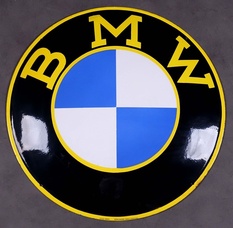

BMW PLAQUE ÉMAILLÉE avant guerre
Enamel sign - painted sign from ANONYME ANONYM
THE BMW ENAMEL PLATE dated between 1917-1936 (see photo history of the BMW logo) is in perfect condition, no restoration.
History of the BMW Logo
In 1917, Franz Josef Popp created the BMW brand (Bayerische motoren werke) in Munich on the basis of Rapp Motorenwerke Gmbh founded in 1913, a manufacturer of aircraft engines. At this time, no logo appears. The young company, however, adopted a logo on October 5, 1917.
The first BMW emblem, registered in the Imperial Trademark Register, retained the rounded shape of the old Rapp logo. The outer ring of the symbol is now demarcated by two golden lines and bears the initials BMW.
Airplane and boat engines…
If the company continues its activities in the aeronautical field, it is banking on other outlets: engines for the automobile sector and agriculture, as well as engines for boats. However, the main activity remains the manufacture and maintenance of aircraft engines for the German army.
A period during which BMW is not interested in direct customers; the logo is not essential. However, at the end of the war, in 1918, Germany no longer had the right to build airplanes. We must find other outlets.
For colors, it’s Bavaria
For its new logo, BMW remains faithful to the Bavarian spirit by using the colors of the Free State of Bavaria, white and blue. However, these are arranged upside down – at least if you read the logo clockwise starting at the top left, as is heraldic tradition.
The black outer ring remains with the three letters. The myth of the airplane propeller that the two colors symbolize in the neighborhood dates from the economic crisis of 1929.
It all comes from an ad
In 1929, the company built a new commercial aircraft engine under license from Pratt & Whitney, an American engine manufacturer. To advertise it, BMW produced a document where the company logo was superimposed on the propeller of the plane. The myth was born.
In 1942, BMW itself gave the propeller its credentials. In an in-house publication devoted to aviation engines, an article embroiders on the image of the propeller rotating. An article illustrated with a photo in which the BMW logo appears, again, in a rotating propeller.
A story never denied
BMW has never done anything to deny this legendary story; it has only strengthened the image of the company and has been perpetuated for 90 years now. A legitimation. The logo is now considered one of the most successful in the automotive industry; which justifies that it has evolved little.
Heraldry specialists even justify the initial choices. Black is the personification of elegance, white is a symbol of purity and attractiveness, and blue means reliability; silver is linked to metal.
These search criteria may interest you:
ANONYME ANONYMART DECOENAMEL SIGN - PAINTED SIGNCARSINDUSTRYFINISHED PRODUCTSRETROMOBILE SHOW FEBRUARY 2025FOCUS


WWW.MASTERPOSTERS.COM
By ESTAMPE MODERNE & SPORTIVE
7 RUE MILTON - 16 RUE CHORON 75009 PARIS
(+33) (0)1 42 80 01 03